North American spatial analogues for projected Canadian climates
The methodology below explains how we obtained the numbers presented in the interactive story See how summers in your city could feel like by the end of the century, published on June 26, 2025.
While we performed calculations for all seasons and many Canadian locations, as described here, we found our methodology worked better for summers in most locations. This is why the interactive story focuses on summers for a selection of Canadian cities.
This analysis compares future climate conditions in Canadian cities with current conditions in North American cities. The similarity between them is calculated using the Mahalanobis distance, considering temperature and precipitation patterns.
The concept is inspired by ClimateData.ca and CCExplorer.
Environment and Climate Change Canada experts and Arthur Charpentier, professor in the mathematics department at the Université du Québec à Montréal, provided valuable feedback on the methodology and calculations.
Questions or comments? Reach out to Senior Data Producer Nael Shiab.
Spatial analogues
Analogue points:
Options
Scatter plot
We can also visualize the data in a scatter plot. When displaying cities, the size of the circles is proportional to each city's population.
Temperature and precipitation data
The CMIP6 seasonal projections come from the Power Analytics and Visualization for Climate Science (PAVICS) platform. Six NetCDF files (2 variables x 3 scenarios) with a total size of 516 MB were provided by Environment Canada. To extract the data, we used the Python package Xarray.
The seasonal normals (1981-2010) come from ClimateNA. They consist of eight TIF files (2 variables x 4 seasons) with a total size of 26.5 MB. To extract the data, we used the journalism library, specifically the getGeoTiffDetails and getGeoTiffValues functions.
Instead of using the absolute values of the projections directly, we summed the normals and projection delta values. Since the spatial scales of the normals (~1x1 km) and the projections (~10x10 km) are different, this approach provides more accurate projection estimates.
We used the 2071-2100 delta values for three scenarios (SSP1-2.6, SSP2-4.5, and SSP5-8.5) based on the 1981-2010 baseline. We worked with the first decile, the median, and last decile values.
We extracted the temperature and precipitation projections for a selection of Canadian cities (more details below).
The temperature and precipitation normals were extracted for a selection of
Canadian, American, and Mexican cities (more details below) and for a grid of
The orange points on the map have temperature and precipitation data, while the grey dots do not. We need this padding of points without values to avoid visual bugs when drawing contours on the map.
The data has been preprocessed in using mostly the JavaScript libraries simple-data-analysis and Turf.
After processing, two files were generated:
- One with the normals for all North American cities and projections for Canadian cities (3 MB / 506 KB gzipped)
- One with the normals for the points grid (2.6 MB / 298 KB gzipped)
These are the two files containing all the data needed for the interactive experience. When the page loads, users download them, so we need to keep them as small as possible.
Cities selection and boundaries
The original list of Canadian cities comes from the 2021 Census Population Centres. A population centre has a population of at least 1,000 and a population density of 400 persons or more per square kilometre.
The list of US and Mexican cities comes from Simple Maps.
To make our selection, we divided each country into 50 square kilometre cells. We then selected the most populated city within each cell. This ensures good spatial coverage with cities that users are likely to recognize.
There are
For the city dropdown menu, we show only cities with a population of 50,000 or
more, including Iqaluit, Yellowknife, and Whitehorse. Users can choose between
The boundaries of Canadian provinces, U.S. states, and Mexican states come from Cartography Vectors. The file has been processed and edited with MapShaper.
The black dots show the cities available to the users in the dropdown menu. The red dots are all the other cities used in the project.
Analogues calculations
Thank you to Arthur Charpentier, professor in the mathematics department at the Université du Québec à Montréal, who helped with the statistical approach.
There are three steps to our calculations:
- Filtering the data
- Calculating the Mahalanobis distance
- Removing outliers with DBSCAN
These operations are triggered each time a user picks a different city, season, or projection scenario and are run by the user's browser. Therefore, the computations need to be lean and fast.
1) Filtering the data
In our context, we consider a data point or a city to be a spatial analogue if:
- Its 1981-2010 average temperature is within the projected temperature range (first and last decile) of the city selected by the user.
- Its 1981-2010 average total precipitation amount is within the projected precipitation range (first and last decile) of the city selected by the user.
However, in some cases, the range of temperatures or precipitation is very narrow. To ensure we still capture cities with similar climate patterns, we add two conditions:
- If the projected temperature range is less than 2°C, we instead use the median projected temperature +/- 1°C of the city selected by the user.
- If the projected precipitation range is less than 50 mm, we instead use the median projected precipitation amount +/- 25 mm of the city selected by the user.
Overall, these steps are straightforward and computationally inexpensive.
In our code, we add a key excluded to each data point. If it is outside the
ranges, it is excluded.
// Types have been removed for clarity.
export default function exclude(data, cityData) {
  const tempMinRange = 2;
  const precipMinRange = 50;

  const tempRange = cityData.temp.p90 - cityData.temp.p10;
  const precipRange = cityData.precip.p90 - cityData.precip.p10;

  data.forEach((d) => {
    if (d.temp === null || d.precip === null) {
      d.excluded = true;
    } else {
      d.excluded = false;
    }

    if (d.excluded === false) {
      if (tempRange > tempMinRange) {
        if (d.temp < cityData.temp.p10 || d.temp > cityData.temp.p90) {
          d.excluded = true;
        }
      } else {
        if (Math.abs(d.temp - cityData.temp.p50) > tempMinRange / 2) {
          d.excluded = true;
        }
      }
    }

    if (d.excluded === false) {
      if (precipRange > precipMinRange) {
        if (d.precip < cityData.precip.p10 || d.precip > cityData.precip.p90) {
          d.excluded = true;
        }
      } else {
        if (Math.abs(d.precip - cityData.precip.p50) > precipMinRange / 2) {
          d.excluded = true;
        }
      }
    }
  });
}
For example, summers in Montreal with a medium-emissions scenario could average between 21.8°C (first decile) and 24.5°C (last decile) with 269 mm (first decile) to 323 mm (last decile) of precipitation.
The projected temperature range is 2.7°C, and the projected precipitation range is 54 mm.
In our data, 322 points (from our grid) and 348 cities have normals within these ranges.
2) Mahalanobis distance
Now that we have our spatial analogues, we want to rank them. We need a ranking for two reasons:
- To find the most similar cities.
- To draw the contours on our map.
The Mahalanobis distance is a useful method for this. It's unitless and scale-invariant, which is handy since we have temperature in Celsius and precipitation in millimeters.
To use it, we first need to calculate the inverted covariance matrix. Our gridded points provide better coverage of the continent, so we use them for these calculations.
We use the function
getCovarianceMatrix
from the journalism library to compute
our matrix using the temp and precip variables.
const gridMatrix = getCovarianceMatrix(
  pointsAnalogues.map((d) => [d["temp"], d["precip"]]),
  { invert: true },
);
Our matrix looks like this.
[
  [1.492761540636337, -0.00043617887010252053],
  [-0.00043617887010252053, 0.004905019128766616],
];
We are now ready to compute the Mahalanobis distance for gridded points and cities. We use the function addMahalanobisDistance from the journalism library.
The function also computes a similarity index from 0 to 1 based on the distance. This index is easier to work with and understand for our audience. It is also useful for our map legend.
To compute the distance, we use the median projected values for temperature and precipitation for the city selected by the user, along with the normals for the grid points and North American cities.
const justAnalogues = [...pointsAnalogues, ...citiesAnalogues];

addMahalanobisDistance(
  { temp: cityData.temp.p50, precip: cityData.precip.p50 },
  justAnalogues,
  { similarity: true, matrix: gridMatrix },
);
For example, here are the distances and similarities between Montreal (medium-emissions summer projections) and a few cities (1981-2010 normals).
As we can see, Chicago is the closest (0.88) and most similar (0.71), which is expected since both its temperature and precipitation are closer to Montreal's median projections (22.8°C / 291 mm).
3) Removing outliers with DBSCAN
Since we use only two variables (temperature and precipitation), some analogues might appear in unusual locations.
For example, if you pick Summer in Montreal with a medium-emissions scenario and switch Remove outliers to False in the options below the map, you'll notice some analogue spots in Mexico.
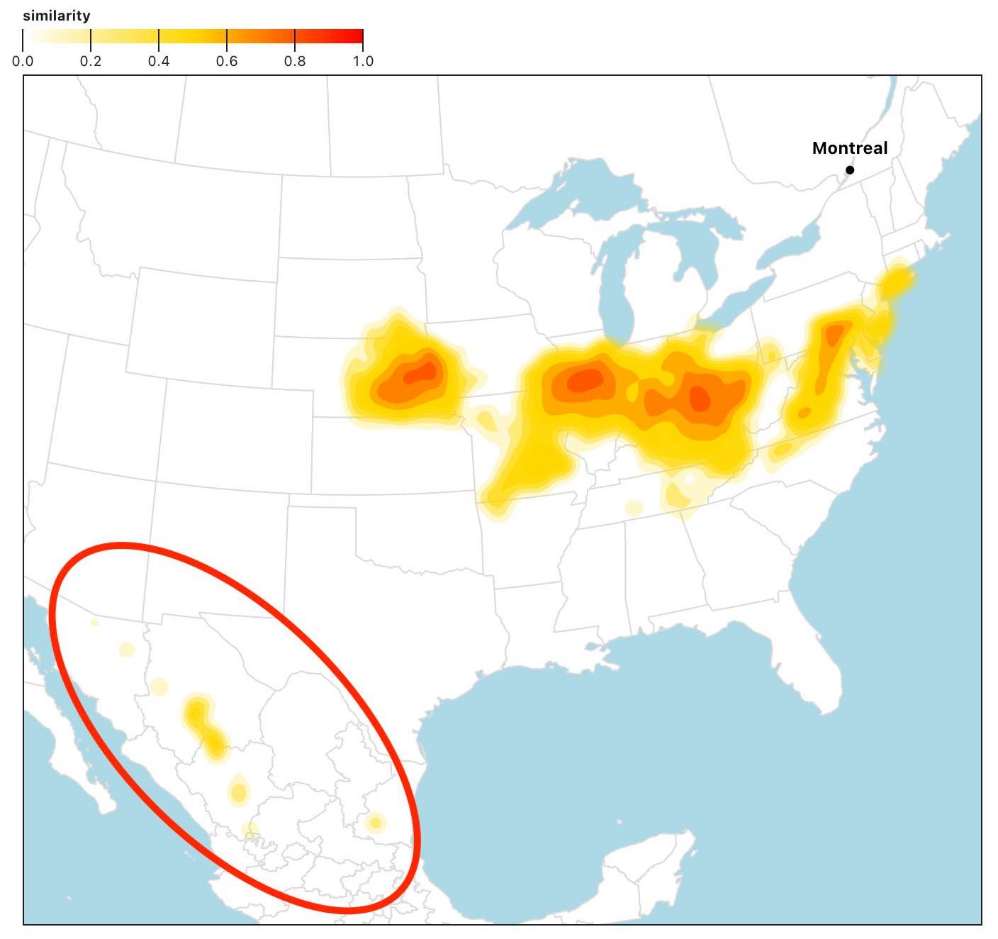
While it's true these areas have similar temperature and precipitation patterns, they are just small spots located far from the rest of the group.
To identify these outliers, we use a modified version of the Density-Based Spatial Clustering of Applications with Noise (DBSCAN) algorithm. It groups together points that are closely packed, marking as outliers those that lie alone in low-density regions.
We adapted the TypeScript implementation addClusters from the journalism library. Traditionally, the algorithm uses a minimum number of points within a radius to define a cluster. However, since we have coastal points and lack data for points on water, we instead use a minimum percentage of neighbours with data, with a hard minimum of 3 (more about it below).
We use a radius of
- At least
% (with a hard minimum of 3 points) of the points with data within km are analogues (which makes it a core point) - It's within
km of a core point (which makes it a border point)
If not part of a cluster, the point is considered an outlier and, in our process, is removed.
There is one exception: if the scenario is Normals, we consider the city as a core point by default.
The distance is calculated with the distance function from the journalism library, which implements the Haversine formula.
Here's how we call the different functions.
const clusterRadius = 250;
const minPercNeighbours = 0.2;

// If the scenario is 'normals', we add the city as a point.
if (scenario === "normals") {
  points.push({
    lat: cityData.lat,
    lon: cityData.lon,
    name: "cityData",
    similarity: 1,
  });
}

// To speed up the process, we filter the gridded points
// for a given season based on the bounding box of the analogues.
const normalsMapSeasonFiltered = filterGriddedPoints(points, normalsMapSeason);

// addCluster adds to two keys to each point: clusterId and clusterType.
addClusters(
  points,
  normalsMapSeasonFiltered,
  clusterRadius,
  minPercNeighbours,
  (a, b) => distance(a.lon, a.lat, b.lon, b.lat),
);

// Outliers don't have a clusterId.
const pointsNoOutliers = points.filter((d) => d.clusterId !== null);
And here is the addClusters function.
// Types has been removed for clarity.
export default function addClusters(
  data,
  normalsMapSeason,
  minDistance,
  minPercNeighbours,
  distance,
  options = {},
) {
  if (options.reset) {
    data.forEach((d) => {
      d.clusterId = undefined;
      d.clusterType = undefined;
    });
  }

  let clusterId = 0;

  for (const point of data) {
    // Skip points that are already assigned to a cluster.
    if (point.clusterId !== undefined) continue;

    // Find the neighbours of the current point.
    const neighbours = getNeighbours(point);

    // Get the minimum number of neighbours a point needs to be a core point.
    // This depends on the minimum percentage of neighbours with data. So it's
    // point specific. Exception for the city point which is added just when
    // scenario is 'normals'.
    const minNeighbours = point.name === "cityData"
      ? 0
      : getMinNeighbours(point);

    // If the point has less than the minimum number of neighbours,
    // it's noise or a border point.
    if (neighbours.length < minNeighbours) {
      // We mark the point as noise initially. We double-check later
      // if it's a border point.
      point.clusterId = null;
      point.clusterType = "noise";
    } else {
      // We know that the point is a core point, so we assign it to a new cluster.
      clusterId++;
      const clusterLabel = `cluster${clusterId}`;
      point.clusterId = clusterLabel;
      point.clusterType = "core";

      // We look for more points to add to the cluster.
      for (let i = 0; i < neighbours.length; i++) {
        const neighbour = neighbours[i];

        if (neighbour.clusterId === undefined) {
          // If the neighbour is not assigned to a cluster, we add it to the cluster.
          neighbour.clusterId = clusterLabel;

          // Find the neighbours.
          const newNeighbours = getNeighbours(neighbour);

          // Get the minimum number of neighbours it needs to be a core point.
          // Exception for the city point which is added just when scenario is 'normals'.
          const minNeighbours = neighbour.name === "cityData"
            ? 0
            : getMinNeighbours(neighbour);

          // If the neighbour is a core point, we add its neighbours to
          // the list of points to be checked.
          if (newNeighbours.length >= minNeighbours) {
            neighbour.clusterType = "core";
            neighbours.push(
              ...newNeighbours.filter((n) => !neighbours.includes(n)),
            );
          } else {
            // If not core, it's a border point.
            neighbour.clusterType = "border";
          }
        } else if (neighbour.clusterId === null) {
          // The neighbour has been classified as noise previously,
          // but now we know it's is a border point, so we add it to the cluster.
          neighbour.clusterId = clusterLabel;
          neighbour.clusterType = "border";
        }
      }
    }
  }

  // We double check if the remaining noise points are reachable
  // from a core point.
  for (const point of data) {
    if (point.clusterId === null) {
      const neighbours = getNeighbours(point);
      const clusterNeighbours = neighbours.find(
        (n) => n.clusterType === "core",
      );
      // If it's the case, it's not noise, but a border point.
      if (clusterNeighbours) {
        point.clusterId = clusterNeighbours.clusterId;
        point.clusterType = "border";
      }
    }
  }

  // Find the neighbours of a point.
  // Here, we use the analogues.
  function getNeighbours(point) {
    return data.filter((p) => distance(point, p) <= minDistance);
  }

  // Get the minimum number of neighbours a point needs to be a
  // core point. Here, we use all gridded points.
  function getMinNeighbours(point) {
    const minNeighbours = Math.round(
      normalsMapSeason.filter(
        (d) =>
          typeof d.temp === "number" &&
          typeof d.precip === "number" &&
          distance(point, d) <= minDistance,
      ).length * minPercNeighbours,
    );

    // We want a minimum of 3 neighbours.
    return Math.max(minNeighbours, 3);
  }
}
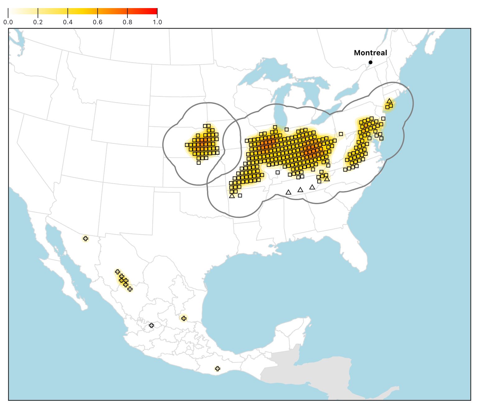
If you switch Remove outliers to false and Show clusters to true, you can see the clusters on the map.
The squares are the core points, the triangles are the border points, and the crosses are the outliers.
The bold grey lines are the combined
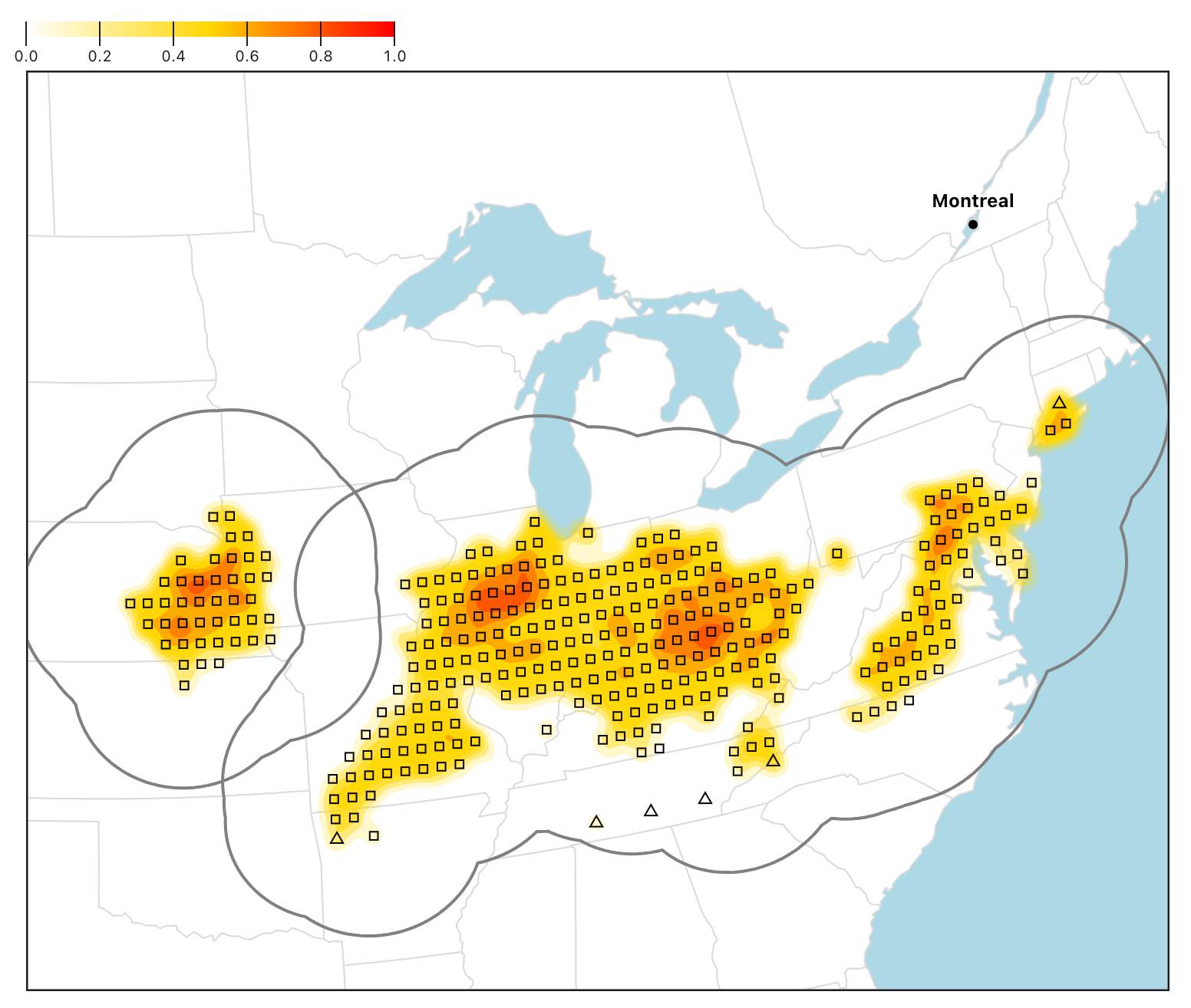
If you switch Remove outliers back to true, you can see the result: the outliers have been removed, and the map is zoomed in on the remaining analogues.
This step to exclude outliers is quite intuitive and fast, which is critical for our interactive application.
The DBSCAN algorithm could be slow with many points, but since we have just hundreds of analogues in most cases, it is able to run in just a few milliseconds in our context.
To ensure that our city analogues are within the boundaries of the clusters (which are computed on gridded points), we run a simple distance test. If a city is within 50 km of a point, we keep it.
const cities = justAnalogues.filter(
  (d) => typeof d.name === "string" && d.similarity > 0,
);

const citiesNoOutliers = cities.filter((d) => {
  for (const p of pointsNoOutliers) {
    if (distance(d.lon, d.lat, p.lon, p.lat) <= 50) {
      return true;
    }
  }
  return false;
});
Percentage of points instead of number of neighbours
To demonstrate why we use a percentage of points instead of a number of points with our DBSCAN algorithm, let's take Montreal summers with a medium-emissions scenario as an example.
If we use New York as a point (the star on the map), we can see
However, New York is by the water, and we don't have temperature and
precipitation data for points in the ocean (black points). Only
So it doesn't make sense to use a minimum number of points to define a core point. We need to use a percentage instead to take into account the context of each point.
So, if we use a minimum percentage of
Here, we have
Map and labels
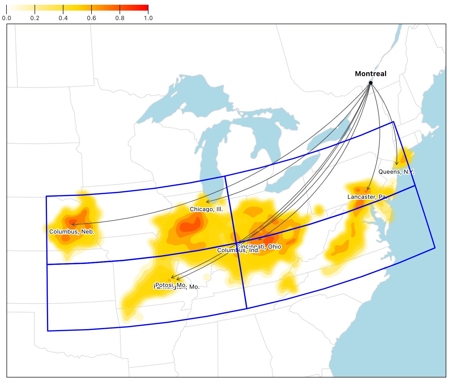
The map is made with Observable Plot. For the contours, we use both cities and gridded points.
To pick the most relevant cities to be labeled, we first divide the area covered by the analogues into four cells.
We preselect cities that have a similarity index greater than the median.
Then, in each cell, we pick the city that has:
- The highest similarity, if any
- The largest population, if any
If this step results in two cities or fewer, we repeat the process with gridded points to make sure we label the map.
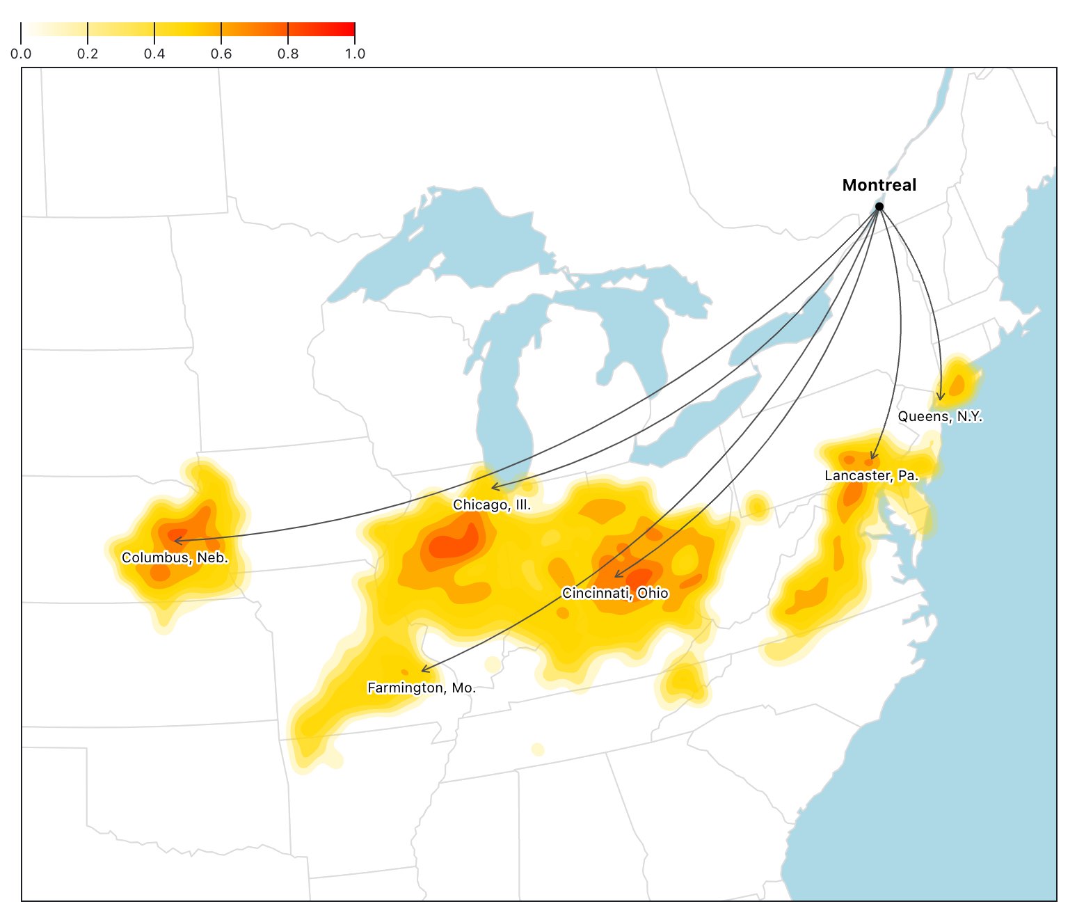
At this step, the map looks like this for Montreal in Summer with a Medium-emissions scenario.
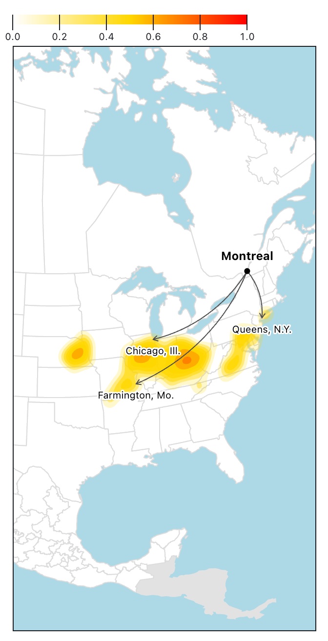
We remove any overlapping labels by first rendering the map and then looping through the labels (which are now SVG elements). In case of an overlap of their bounding boxes (plus some padding), the city with the smallest population is removed.
Here's the result.
This technique works great with all screen sizes. On smaller screens, more overlapping will occur, so more labels will be removed, but there will always be a good mix of relevant and populous cities.
Here's the result on an iPhone SE (375 x 667).
These steps ensure that we have a good mix of relevant cities that users have a chance to recognize.
Tests
All
Overall,
Here's the breakdown per season and scenario:
- Winter:
- Normals:
- Low-emissions:
- Medium-emissions:
- High-emissions:
- Normals:
- Spring:
- Normals:
- Low-emissions:
- Medium-emissions:
- High-emissions:
- Normals:
- Summer:
- Normals:
- Low-emissions:
- Medium-emissions:
- High-emissions:
- Normals:
- Fall:
- Normals:
- Low-emissions:
- Medium-emissions:
- High-emissions:
- Normals:
And here's the table with all the results. A ✅ means that at least one cluster has been found, while ❌ means no cluster has been found.
Contact
Questions? Comments? Reach out to Senior Data Producer Nael Shiab.